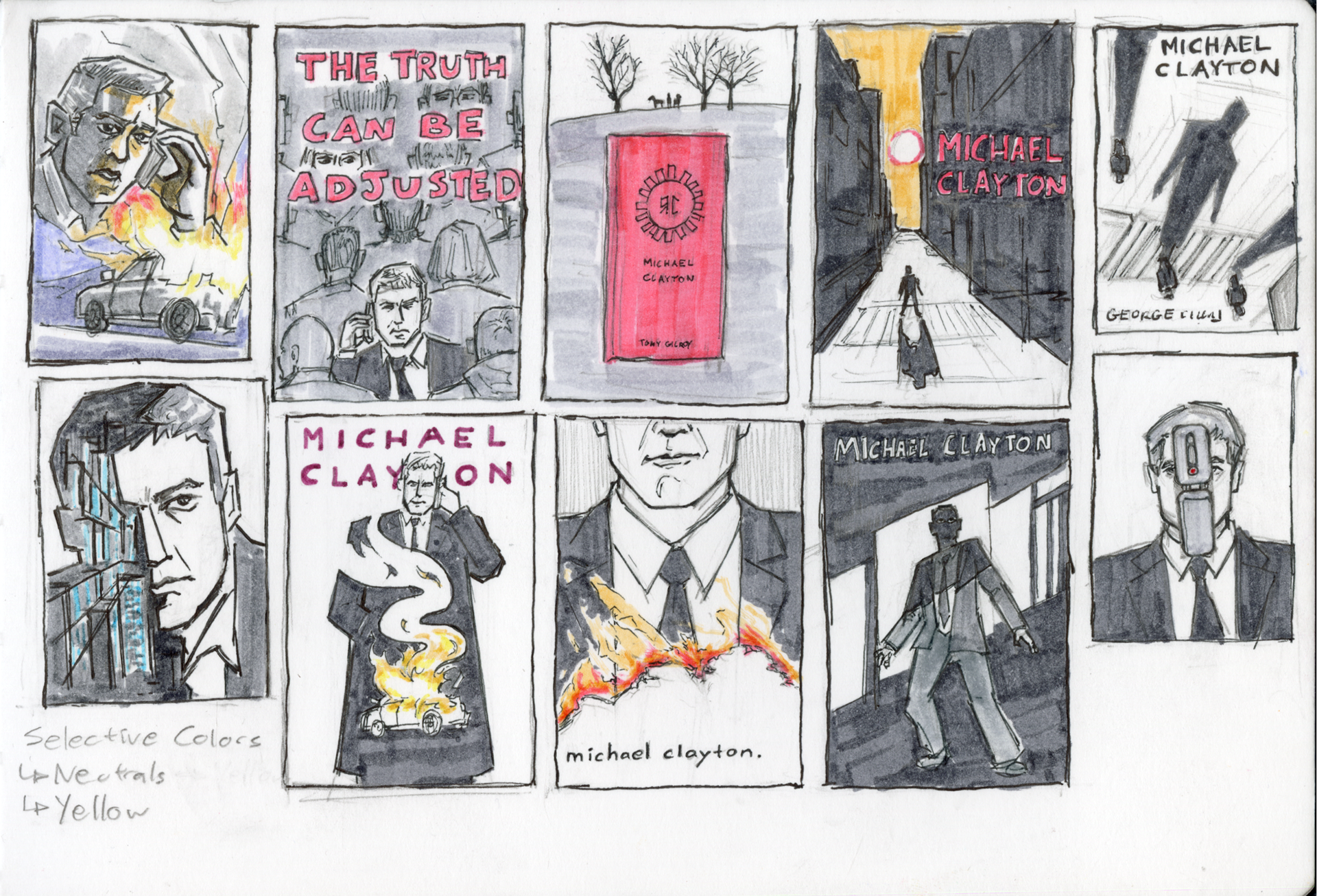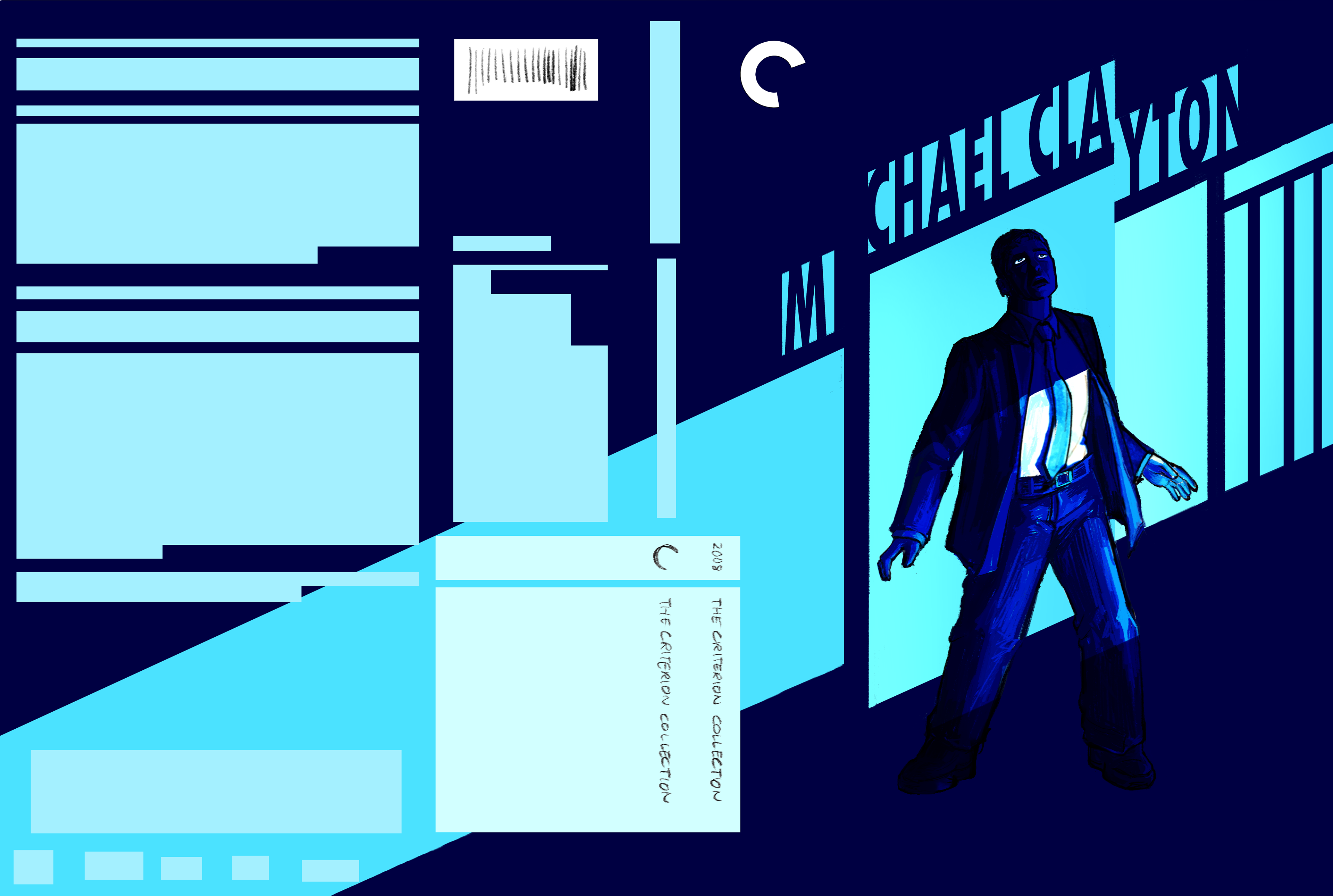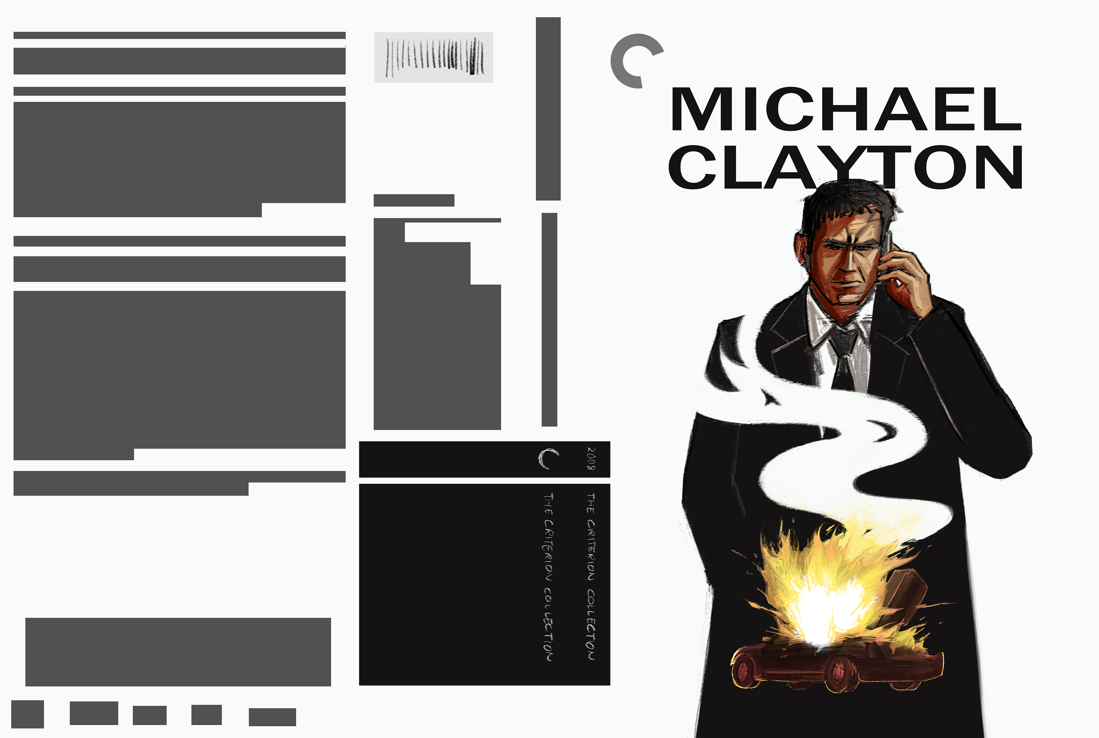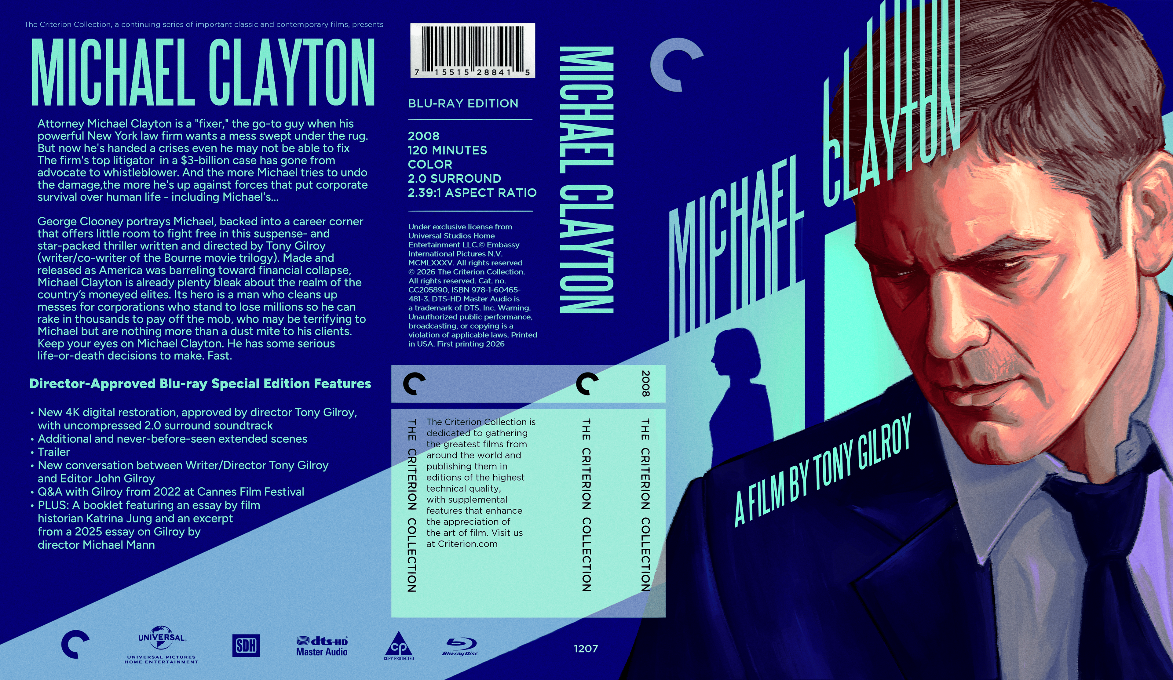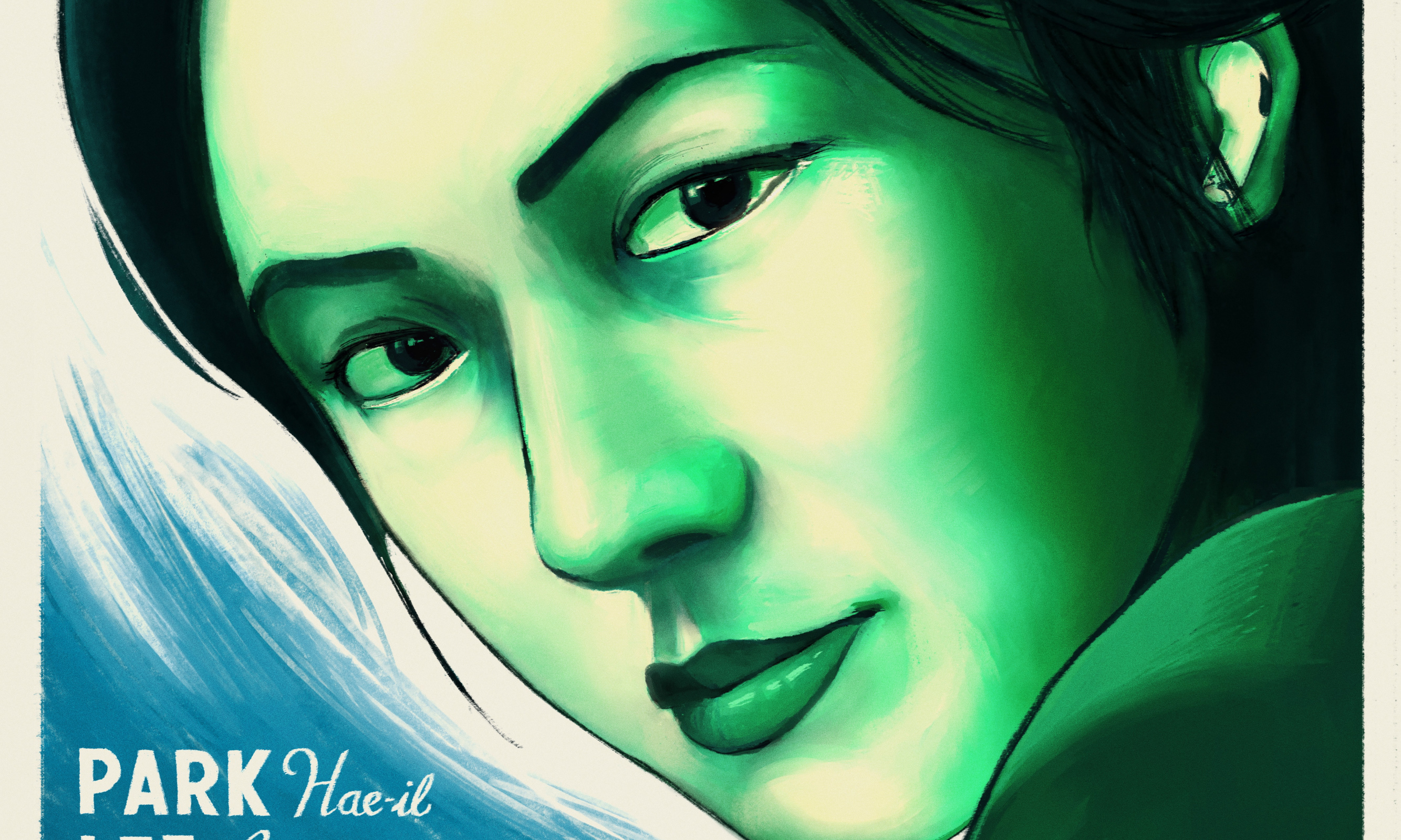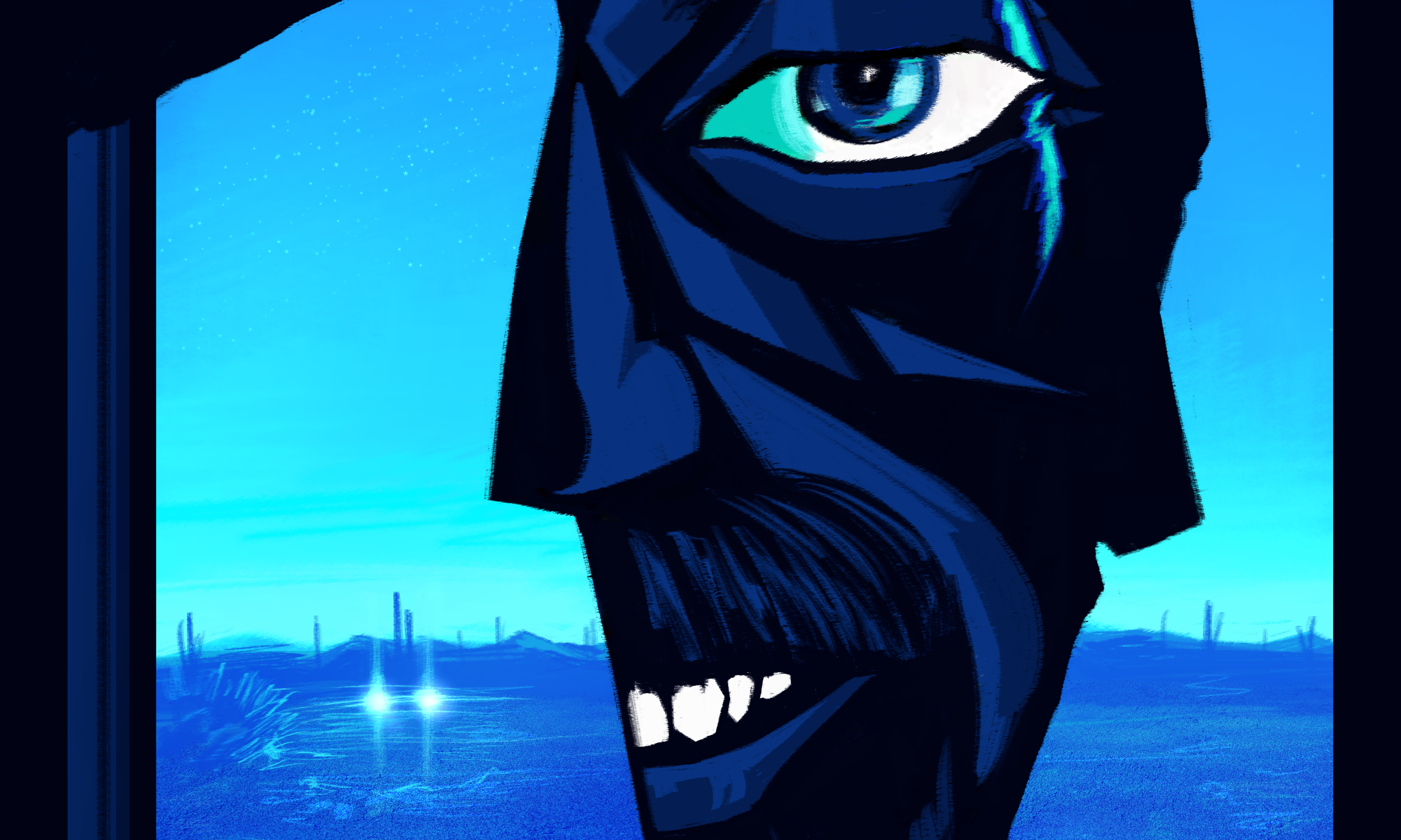

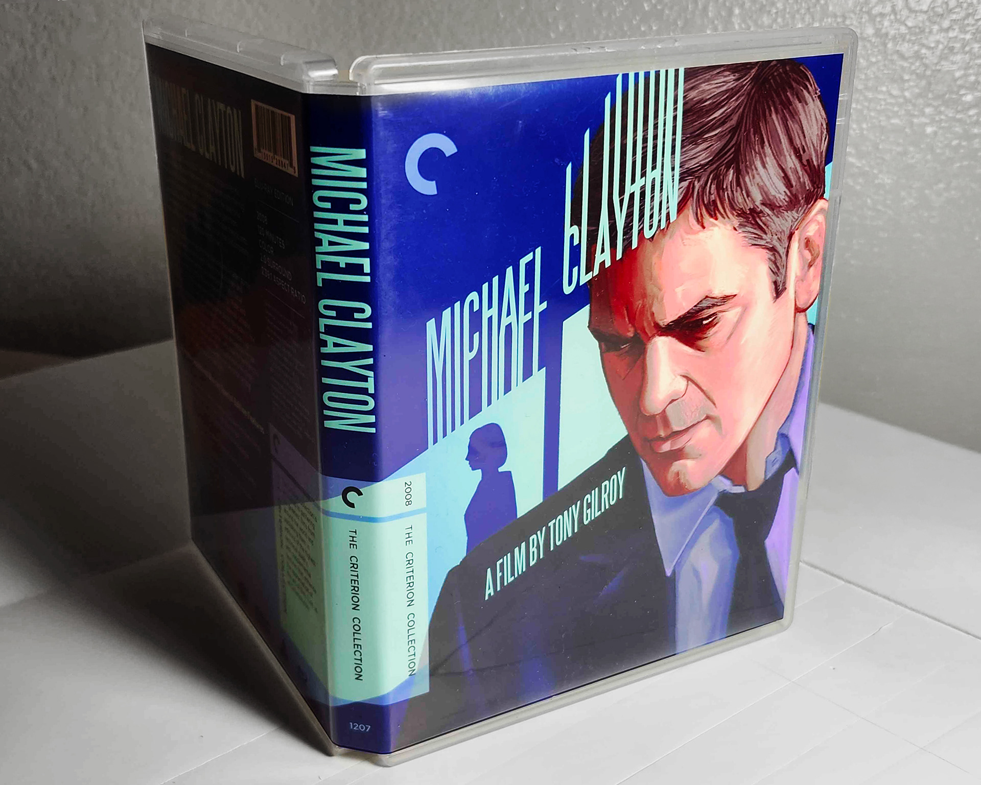
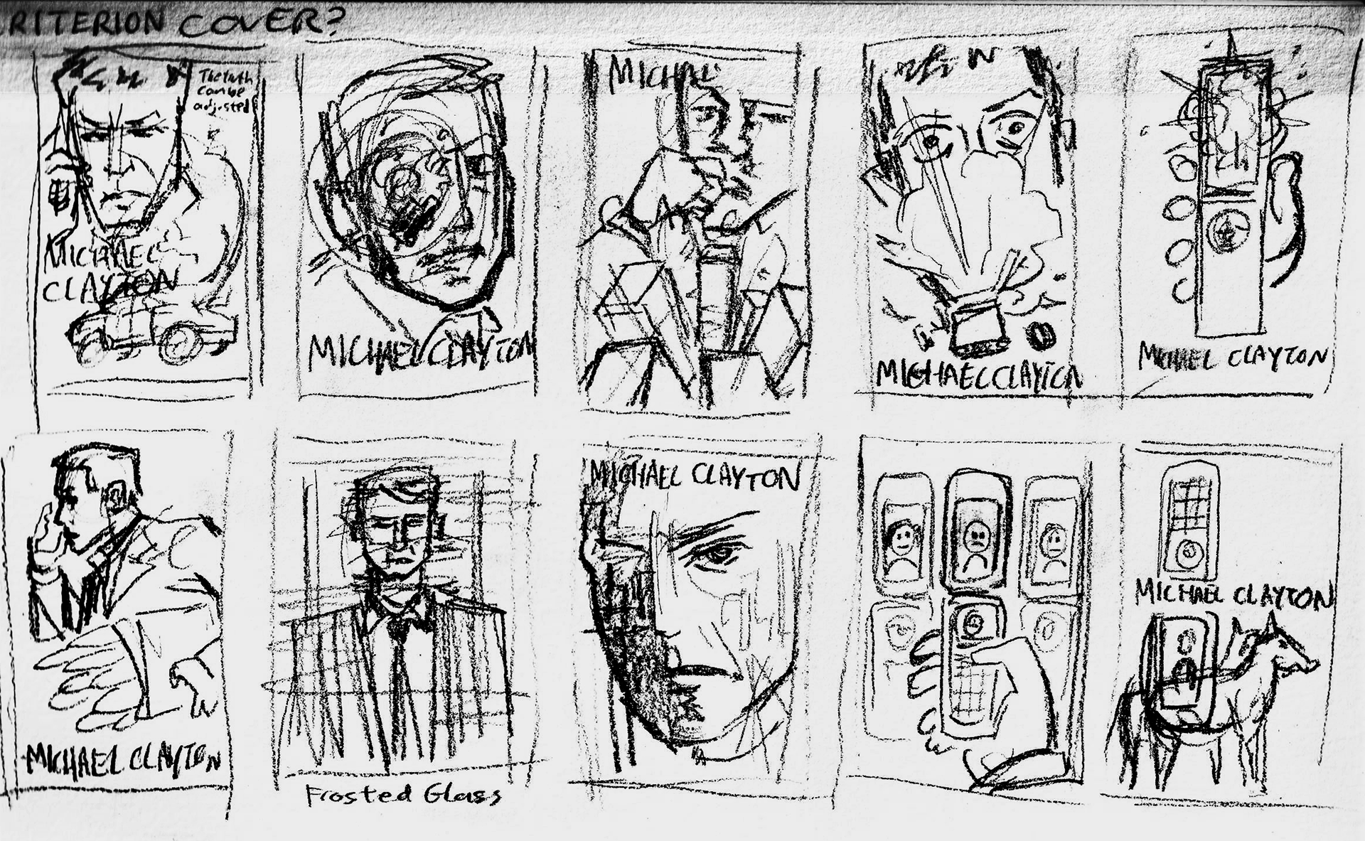
I've long been a fan of the Criterion Collection, and so I took it upon myself to design a DVD case jacket for one of my all-time underrated favorite films, Michael Clayton. I examined a lot of the symbolic and graphic design techniques used by many Criterion illustrations as I created my cover. Long, harsh shadows felt like the right choice, considering a lot of the conspiracy thriller elements of the film. Lastly, getting Clooney's likeness down was incredibly important to selling the concept of the whole thing. What would Michael Clayton be without him?